Explore! Interactive
An Augmented Reality, STEM Education Game
Duration: 4 weeks
Client: Explore! Interactive
Tools: Sketch, Axure, Zoom
Role: UX Designer
Deliverables: Research plan, competitive analysis, interview transcripts, research synthesis, concepts, wireframes, Axure prototype, annotations
The Brief
Explore! Interactive is an augmented reality (AR) educational game geared towards 3rd-6th grade students. They focus on teaching students STEM (science, technology, engineering and mathematics) topics to get them comfortable and excited about learning and pursuing STEM education and professions.
When our team was brought on to help, their game had one level developed that was designed to teach the basics of circuits and energy. Explore! Interactive uses mark-based augmented reality technology, which means that it requires a predetermined mark, or target, to trigger the augmented reality effects. They decided on using a set of playing cards to satisfy this need.
Our Mission:
Explore! Interactive needed our help coming up with an onboarding solution, teaching players how to play the game, and how to handle errors that players might make. They wanted help with these, all with the overarching desire to somehow incorporate storytelling into their game.
Explore Interactive had this complex and interesting backstory for their game but did not have a way to introduce or integrate it into the game as the player progressed through.
They gave us some initial do’s and don’ts:
Don’t:
Include lots of text
Make players go through laborious tutorials
Clutter the screen
Do:
Make onboarding quick
Make instructions easy to understand
Increase engagement
Research It
Our team took some time initially to research and understand the industries that Explore! falls into: augmented reality, technology used in education (edtech), STEM education and mobile gaming for kids.
With these areas of interest, we started to see some themes with products that currently inhabit the market and see the space for the competitive advantage that Explore! Interactive has.
User Interviews
Since this is an educational game currently intended for classroom use, we interviewed both teachers and students. With students we needed to know what games they play, what they like and dislike about them, and their attitudes towards games at school. With teachers, we needed to understand how they choose supplemental materials, how much freedom they have, and if/what they look for to gamify learning.
Insights from teachers
Teachers have a lot of freedom to choose supplemental materials, but have certain priorities
Kids decide early on if they are a science or math person
Students love games and competition
Accessibility is a concern when using technology in the classroom
Insights from students
Students like the ability to keep trying if they get something wrong
Students need a balance between being challenged and being able to be successful
Students connect to games with characters and a story
Problem Statement & Design Principles
Teachers of 3rd through 6th grade students need a supplemental tool for their STEM lessons in order to engage their students in a fun and meaningful experience, and build positive connotations to STEM that encourage further exploration.
Fosters Growth
The content needs to be challenging and but allow room for trial and error, leading the way for growth, development and a sense of accomplishment.
No Previous Experience Necessary
The product should be able to suit the individual learning level of all the students using it and inspire them to experiment with concepts inside and outside the application.
Easy to Implement
The product should allow teachers to implement it at their discretion without time commitments or specific curriculum requirements
Drive it Home
The design will aid in progressing the game through storytelling, incentivizing users to continually achieve new goals and encouraging maximum recallability.
Personas
Bonnie Teacher
Limited time for curriculum prep
Needs engaging materials
Materials need to align with class curriculum
Materials need to fit within her class budget
Brody 3rd Grade Student
Prefers creative homework assignments
Likes to work with his friends in science class
Collaboration > competition
Loves getting to be creative in class and do activities that are more hands on
Sketch It
During ideation, we generated concepts that would match the needs of Explore!, give us more understanding of how students want to interact with games, and validate or invalidate our own and Explore!’s assumptions. We tested a few different concepts for error handling, character creation, story progression, teacher-facing tools, and onboarding.
Click image to enlarge sketches!
Keep in mind, this game is for 3rd-6th graders, meaning game levels would be the same regardless of grade, so our designs needed to be compelling to both 8 year olds and 12 year olds. This encompassed the visuals, language, amount of text, and pacing. We had to balance the more advanced 6th graders with the younger 3rd graders: it couldn’t be so easy that it bored the older students and couldn’t be so hard that it discouraged the younger students.
We had 10 concept sketches that we asked students and teachers for feedback on, and we learned that we would really need to lean into storytelling to engage users of all ages and needed to make sure that the way we wrote was simple and direct and didn’t coddle or overcomplicate.
From there, our team identified the concepts that were worth developing further and digitized them for continued testing.
Test It
Hybrid Testing
Our team had an amazing opportunity to take our initial prototype to the PopUP Science event at the Homewood Science Center where we conducted hybrid concept and usability tests with students and teachers.
The choice to continue to get concept feedback at this point was a result of our short time on this project. With 4 weeks to produce something usable for Explore! we needed to take advantage of the face time we were able to have with students, so not only were we monitoring for usability issues but we continued to ask for feedback on the logic of our concepts and the desirability of them.
With their help, we were able to continue to eliminate some pieces of our design and iterate the parts we wanted to keep.
Improve It
We focused our last iteration of our converged prototype on the onboarding experience for first time players where we included concepts that can be used throughout the game. Our prototype needed to mimic the camera, the 3D aspects and be timed so that when students placed a card in front of the iPad, it would appear on the screen at the same (or similar) time. We used a picture of a table as our background so that it would appear to be the view of the camera, and we set time delays on certain actions in our prototype so that students would understand that what they were seeing on the screen was a result of how they placed the cards.
Enter Explore! Interactive
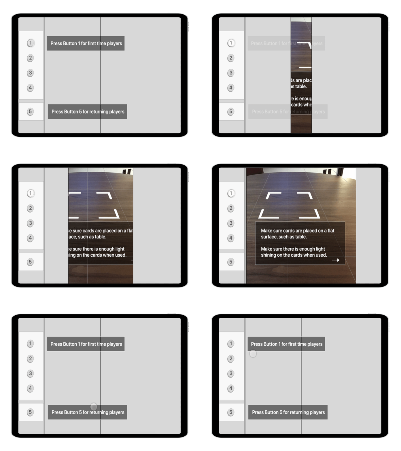
Onboarding for the game kicks off with a concept inspired by elevator transportation to introduce players into the world of Explore! Interactive as well as incorporate the backstory of a main character’s underground lair.
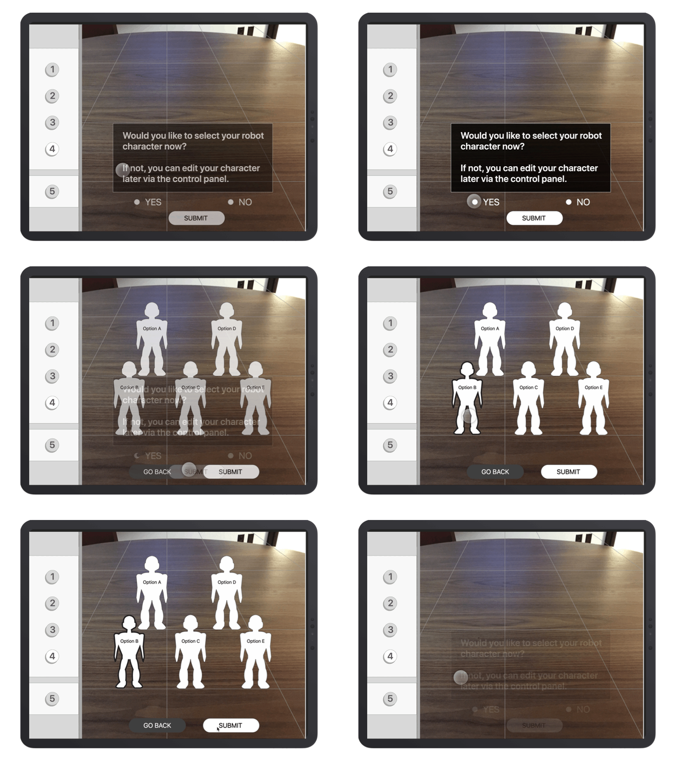
Pick your character
Our research showed students connect most to games where they play as a character that represents themselves, which informed our decision to include this character selection step. Originally, this concept was geared toward character creation. The decision to iterate to a character selection was in part due to privacy concerns with the game having the ability to access the camera and take pictures and also an effort to simplify development for the Explore! team.
Story integration
After the player chooses their character, they are ready to begin the game. This step prompts the student to place our control panel card in the designated space, and gives Explore! a way to continue to tell their story. This design decision takes advantage of Explore!’s use of mark-based augmented reality technology and can easily translate to later versions where playing cards are no longer necessary.
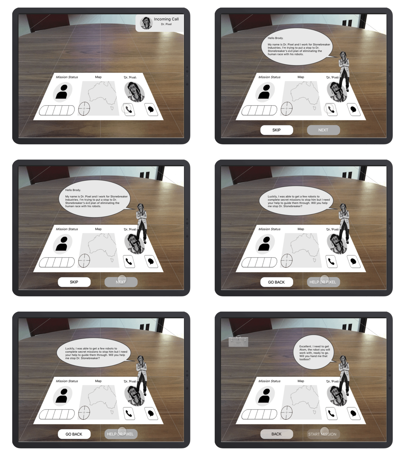
Meet Dr. Pixel
Leaning further into storytelling and the world that Explore! created, we introduce the player to Dr. Pixel. She is enlisting the player to help her on top secret missions. Students were not put off by larger amounts of text as they pertained to the story, but we still tried to keep them short(ish).
Test out the controls
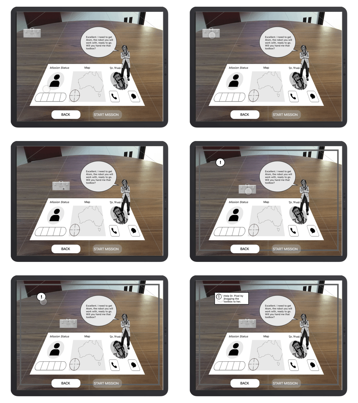
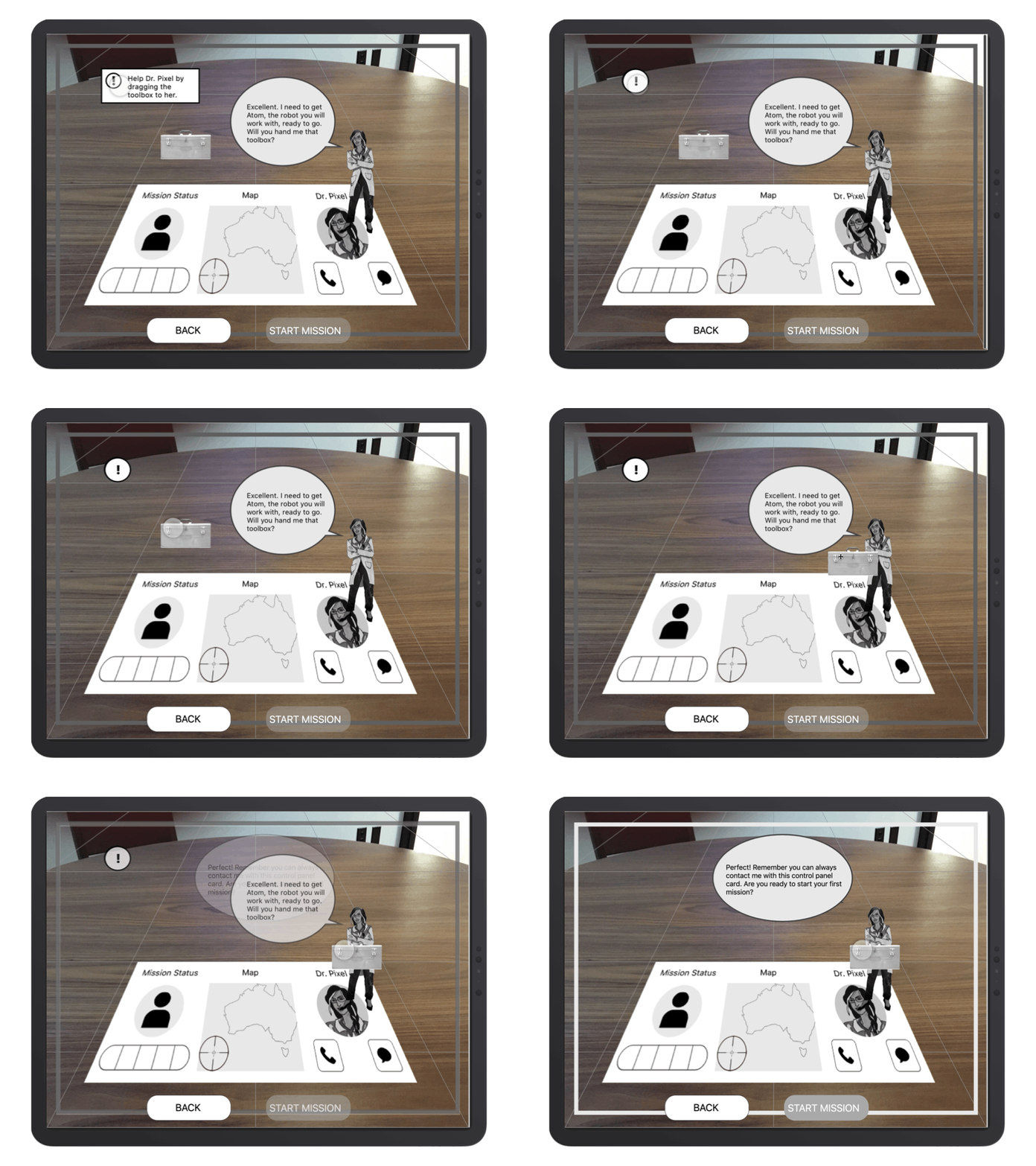
We included a final step in onboarding that would teach players how to play without a boring tutorial. Dr. Pixel asks the player to hand her the toolbox so players can understand the drag and drop motion and demonstrates how the game will respond to mistakes.
Try again!
Students understood that the exclamation point icon was a place they could seek additional information on their task. Most students didn’t need it at this point, but they liked that it was available. In order to keep the design adaptable to multiple grade levels, this icon is clickable so instruction is not forced but available as needed or desired.
Wrap It Up
Our team learned so much from working on this project. Explore! Interactive was a dream client, providing us with an opportunity to design for augmented reality, a game, and allowed us to work with kids.
This project reinforced for me the notion that constraints demand and produce higher levels of creativity, which I so sincerely mean it when I say was a treat. I would jump at the chance to continue refining and building out our solutions for the game and explore some of our other concepts that we put on the back-burner, such as a teacher facing tool as teachers were excited about being able to track student progress and usage.
4 weeks was too short a time to work on a project this exciting and we are looking forward to seeing how Explore! grows and makes an impact on education and the next wave of STEM leaders.


